 Ensuring the best possible user experience is crucial to moving potential subscribers through your digital checkout line. Every step matters. Yet publishers often overlook — and undervalue — the registration and subscription pages they rely on to sign up these readers.
That is a costly mistake.
The importance of user-friendly registration and subscription pages should not be underestimated. Designed well, they capture needed revenue and strengthen connections with readers. Designed poorly, they push potential subscribers out the door.
A basic guideline is to keep registration pages brief and simple. Publishers may be eager for personal data, but they should not ask for too much here. The more fields or tasks users must complete, the more likely they are to abandon the page.
Another guideline: Test to see what works best. There is no single answer. Publishers should make it a priority to experiment with different components, offers, wording and design.
What follows are best practices that news organizations have used to sign up readers and avoid turning them off with clunky requirements. You can adapt these approaches and others to suit the realities of your marketplace and support your larger digital marketing strategies.
Remember: More and more subscriptions — print and digital — will be paid for on these kinds of pages. They are a key to your future.
Guide your readers to an easy sign up
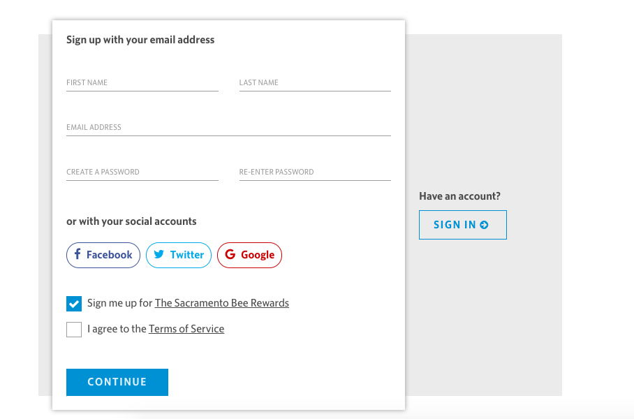
Staying on message: The Sacramento Bee
Registration forms have only one job. Weighing them down with non-critical details is harmful. The Sacramento Bee uses a streamlined and uncluttered registration form that makes perfectly clear what it wants the user to do, which is to register for a subscription and create a digital account. With only a few fields to complete, this form is easy to understand, quick to get through and user friendly. There are no distractions.
It also offers an even easier option — the ability to sign in with a user’s social media accounts.
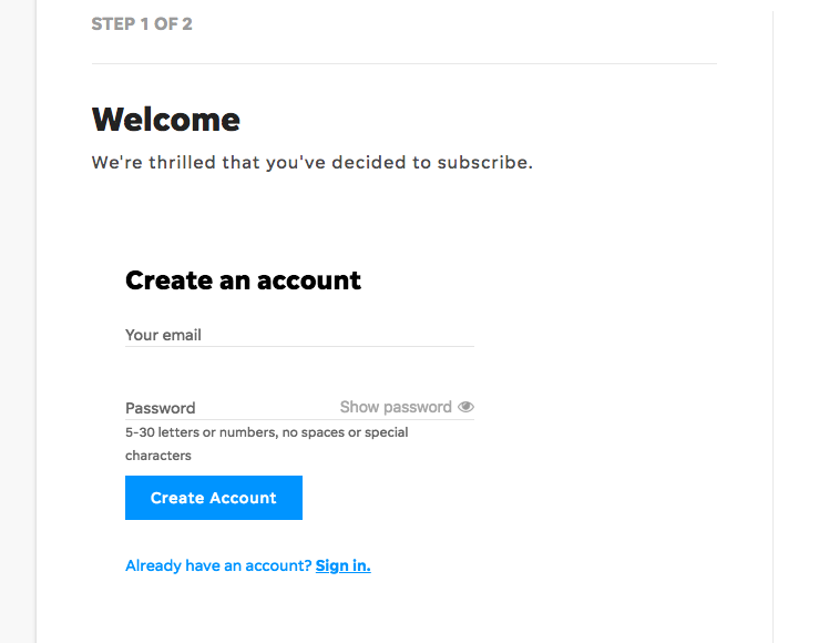
A friendly welcome: The Detroit Free Press
The following sign-up form offers a warm and friendly user experience, and requires only an email address. The one-step tactic is effective, because each added step increases the risk that the user will abandon the process before it is complete.
Simplify the copy with bullets
Even with a minimal approach and a streamlined design, pages will still need some information. This is no place for a dense narrative. Consider using bullet points or icons to minimize reading effort and make scanning easy.
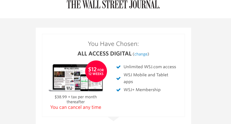
Optimizing layout for key messages: The Wall Street Journal
In this Journal ad, the bullet points take up the same amount of space as the main graphic, and each one highlights a clear benefit of paying for digital access. Readers’ eyes are drawn to the bright blue check marks, which make these bullet points the focus of this pop-up.
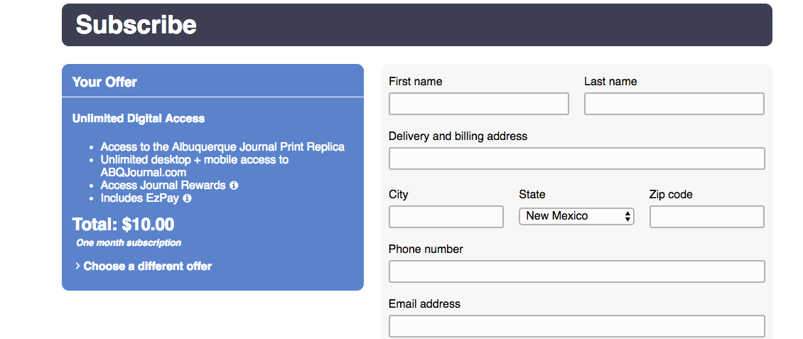
Offers that readers cannot miss: The Albuquerque Journal
The Albuquerque Journal arranged this offer with bulleted messages on the left of the registration form. Since people read from left to right, they quickly spot these key benefits of subscribing (along with an option to choose a different offer).
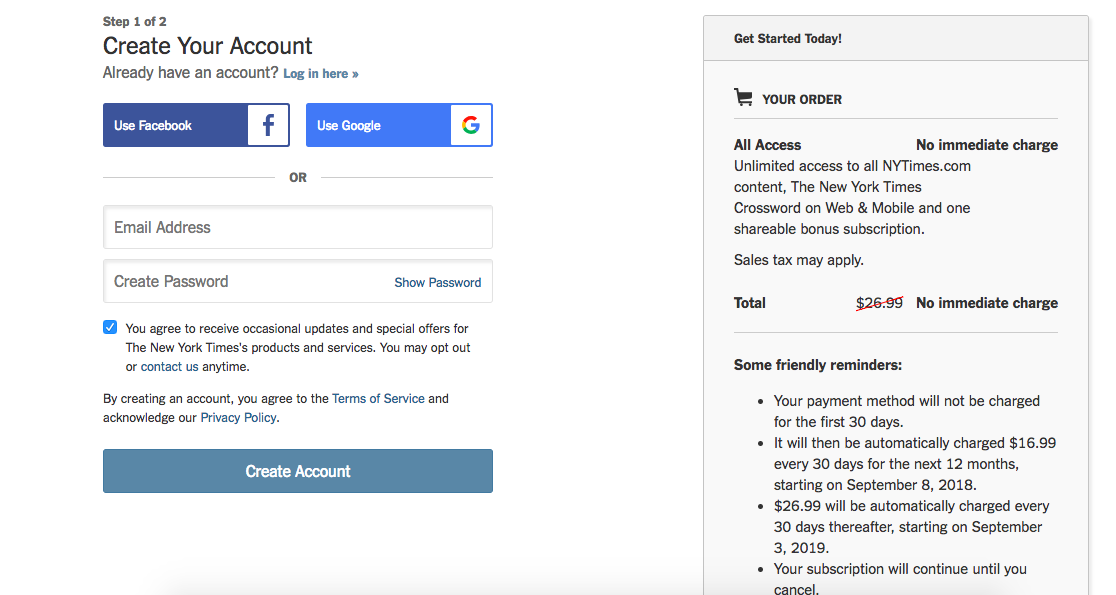
Highlighting what matters most: The New York Times
Sign-up forms should never distract with extraneous content. So it is vital that any details be presented in a way that does not slow the process of signing up and undermine the purpose of the page. The New York Times includes some customer service and account information off to the right side of the page, but it is clearly not the main focus. The crucial sign-up information stands out in a bulleted format, making it easy to absorb and act on.
Offer a clear value proposition
Consumers will only pay if they believe a subscription is likely to bring benefits that will improve their lives. Smart registration forms reinforce these crucial messages and adapt them to their own brand identities, while making it easy to sign up.
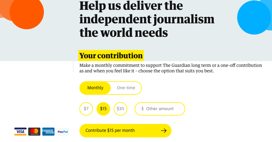
Engaging readers in a larger cause: The Guardian US
Each element should align conceptually with the topic and goal of the page. In this Guardian US form, the word “contribution” links the payment to a greater social benefit. Also, the language supports the notion that users have control over their contribution.
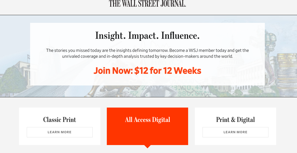
Appeals to personal aspirations: The Wall Street Journal
Using the word “member” reinforces the elite brand position of the Journal and tells subscribers they are part of something exclusive, that they are in the know, and the Journal is their gateway. The header plays into the reader’s current or aspirational position.
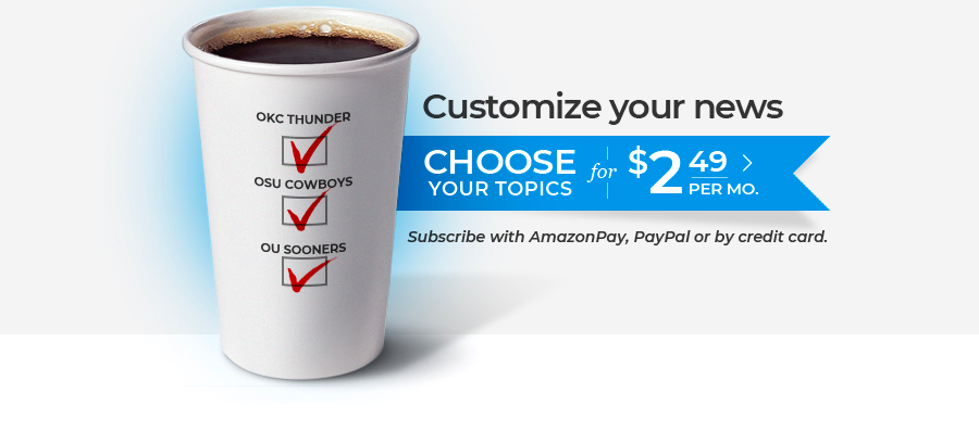
Offers to customize: The Oklahoman
One way to provide value is to give readers options for customizing their content. This ensures that subscribers get more personally relevant information and experiences. And it is a natural strength of digital. The Oklahoman uses this tactic to connect with local sports fans, calling out their popular basketball and football teams by name.
Offer multiple secure payment options
Not so long ago, subscribers were paying for their subscriptions with checks or credit card information sent through the mail or invoices they got in a telemarketing campaign. But as online payments became more secure and trusted, they became customers’ preferred method of payment. Through various partnerships, publishers are now able to offer customers the convenience of multiple ways to pay for their transactions.
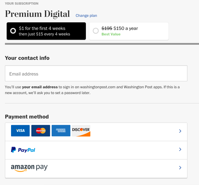
Lots of payment options: The Washington Post and Star Tribune
This page from the Post offers four different credit card payment options, along with PayPal and Amazon Pay — six in all. It also clarifies that users will use their email address to sign on, and that they will need a password if they are creating a new account. While brief, the message assures readers as to how their information is used and protected.
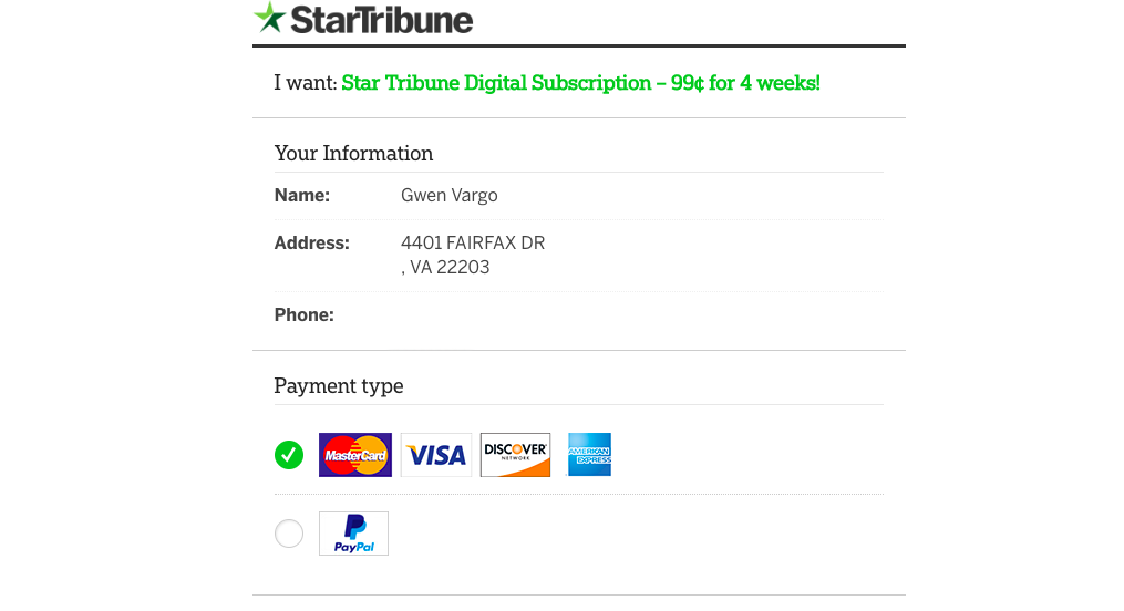
 The Star Tribune sign-up form is straightforward and offers almost as many payment options.
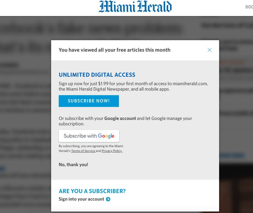
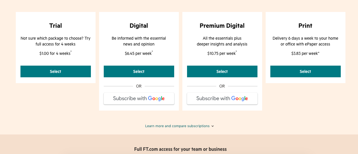
Subscribe with Google: The Financial Times and Miami Herald
Google has introduced a platform that enables readers to subscribe to participating newspapers through their Google accounts, with one easy click. Some publishers are now testing this approach, including The Financial Times, the Miami Herald, McClatchy and The Washington Post.
According to Google, the goal is to help publishers drive conversions, while also making it easy for readers to subscribe, stay logged in and engage with content they appreciate.
Create mobile-friendly forms
Readers are consuming more and more content on mobile devices, including email newsletters. So it is crucial that forms display well and are user-friendly on their smartphones. Connecting through mobile is a big and growing opportunity for publishers to register new users and subscribers.
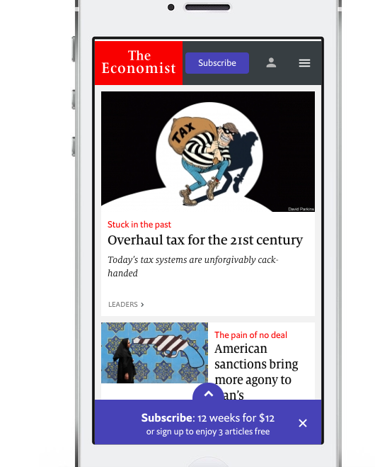
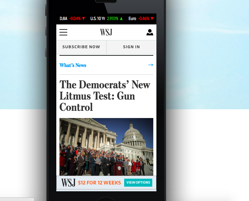
Optimizing a page: The Economist and The Wall Street Journal
Even on a smartphone screen there can be room for more than one appeal to subscribe. In the Economist example, the call to action appears at the top and the bottom, unified by a color that stands out. (The ad at the bottom offers choices for a discounted subscription and a trial registration.)
The Wall Street Journal entices readers with a clear layout and strong calls to action at the top to subscribe or sign in. A discounted subscription offer runs across the bottom with a link to different subscription options.
 |
 |
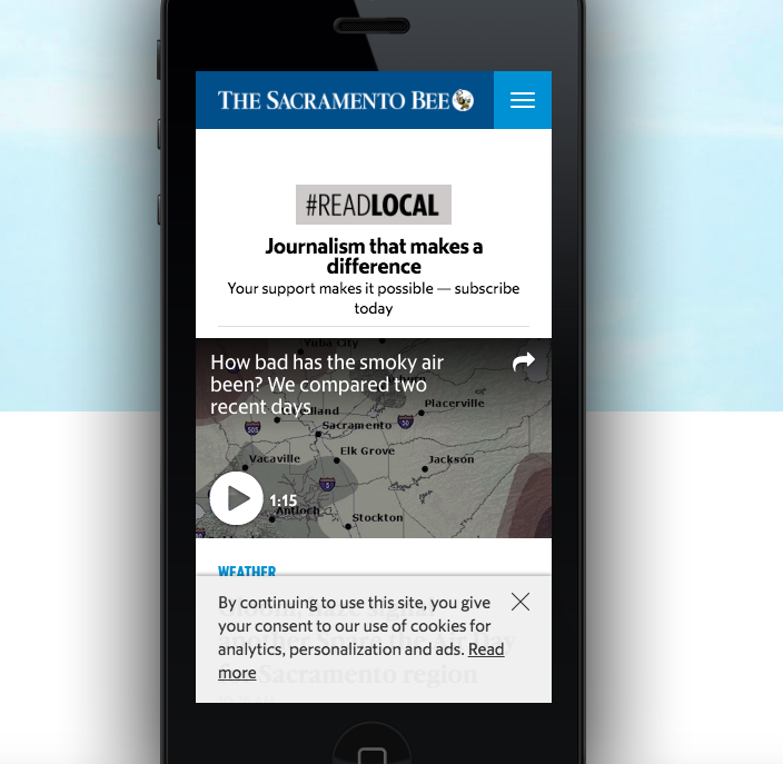
A trusted source: The Sacramento Bee
The Bee reinforces its value in providing local “journalism that makes a difference,” which benefits residents of the community. Recognizing the value of this important social good, they have positioned their subscription as a way to support local journalism in general, and designed an ad that looks good on a small screen.
Provide easy access to customer service
Even with the most streamlined pages and clearest value propositions, potential customers may have questions as they go through the process of registration and — especially — subscription, which is a greater commitment. Publishers should strive to ensure the best experience for these interested users, not just do what is easiest for their organization. That includes offering different ways to contact customer service.
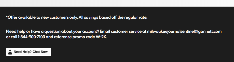
A phone number you can’t miss: The Milwaukee Journal Sentinel
A phone number for customer service should never be hard to find. For starters, the number must be included on the page. But that’s not all. The number also should be easy to spot. The Journal Sentinel’s subscription landing page header displays the customer service phone number prominently in the upper right corner, along with an offer code for a subscription discount.
The page footer also displays the customer service number with the promo code, as well as the customer service email address and a live chat option.
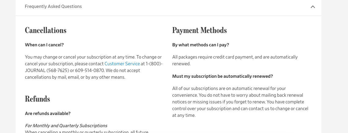
Frequently Asked Questions: The Wall Street Journal
FAQs are an effective way to address common issues that may be on the minds of new subscribers, and saves them the step of contacting a customer service representative. The Wall Street Journal displays several FAQs at the bottom of its order/subscription page.
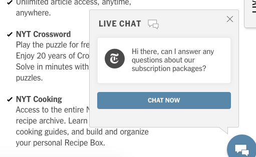
Live chat: The New York Times
The Times proactively keeps a live chat window open with a message specifically referencing subscriptions. This encourages a personal connection, starting the one-to-one relationship, while specifically addressing the subscription packages and giving focus to the chat. There are different ways to facilitate live chat, and news organizations can choose among various vendors who will build a platform.
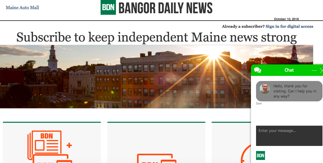
Personal touch in the chat box: Bangor Daily News
The Maine paper offers a more personal, conversational, small-town feel in greeting readers via its chatbox. The photo of the customer service rep adds a homey touch.
Additional resources
Marketing Experiments is part of the MECLABS Institute and offers a collection of optimization-related experiments and case studies. They also offer certification programs and training.
The MarketingSherpa blog reports inspirational stories of customer-first marketing to give marketers insights, inspiration, and instructions to improve their results.
- Marketing 101: What is funnel creation?
- Call-to-action optimization: 132% increase in click-through from changing four simple words
Hubspot provides marketing, CRM and sales solutions. Their blog covers various aspects of e-commerce, digital and email marketing, as well as sales processes and systems.
OptinMonster offers solutions to convert existing website traffic into leads and sales. While it focuses on e-commerce overall, there are still practices and tips that can be used in news and media organizations.
* * *
The Reader Revenue Toolkit will continue to grow over time as more resources are added. As organizations continue to find innovative ways to get more and more of their revenue directly from readers, we will be surfacing their examples. Question you need answered? Something missing? Are your own reader revenue initiatives and projects proving successful and you want to share? Reach out to readerrevenue@pressinstitute.org, or sign up to receive updates as new resources are added to the toolkit.
You might also be interested in:
We gathered news leaders and non-news experts to discuss what it looks like to build sustainable youth engagement efforts into their coverage and fundraising. We asked four summit participants to share more about the ways they are funding experiments with youth engagement in their communities.
The study’s findings likely align with news engagement behavior you’re already noticing, but the data across age groups shows these shifts cannot be written off as a passing trend that younger generations will age out of. Here are four key takeaways and what they mean for local news.
This report draws on a nationally representative survey of teens ages 13–17 and adults 18 and older, providing one of the most comprehensive, generationally comparative looks at how Americans navigate an increasingly complex news, information and media ecosystem.

