Charting stock and tweets
Creator: The Wall Street Journal
Summary: Fever charts are played alongside tweets by Donald Trump to reveal how a company’s stock and its major index performed after a mention from the president.
_____________________________________________
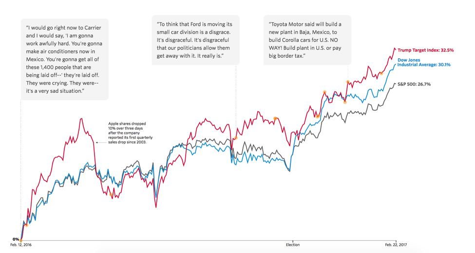
Even before Donald Trump was elected president, news reports covered his attacks on companies like Carrier, Nordstrom and Boeing, speculating that his loose lips could sink stocks.
But sometimes conventional wisdom needs a reality check.
Wall Street Journal data reporter Shane Shifflett “wondered what impact, if any, [Trump’s] negative, protectionist-flavored tweets had on investors.”
“I questioned how those companies as a group were performing against the market since it seemed like the Dow was either perpetually approaching or setting new records after the election.”
The Journal created a “Trump Target Index” made up of all the companies that Trump had mentioned to compare their performance against the Dow and S&P 500 as a whole.
(Shifflett is quick to point out that he wasn’t the only one checking the markets — Axios and Reuters both published pieces looking at the change in stock after Trump targeted a company.)
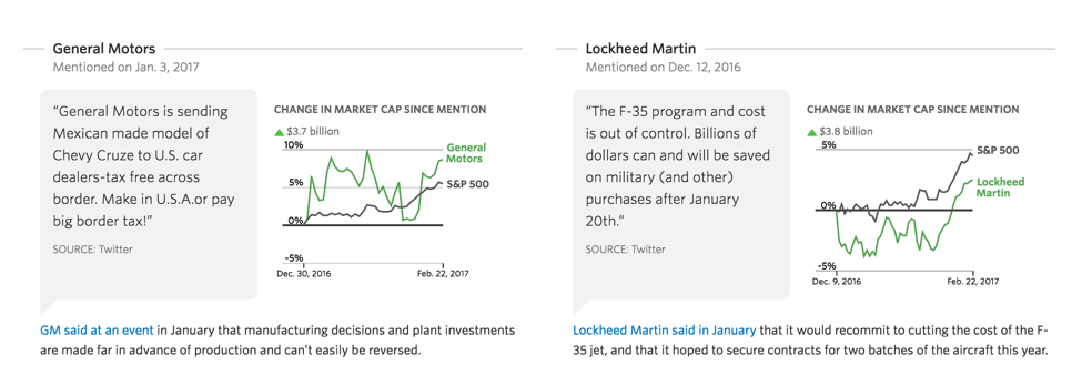
The Wall Street Journal’s visualization strips out embellishment and analysis and lets fever charts do the talking, showing how companies and the major index each one was in performed post-tweet. While some companies’ stocks showed an initial dip, the longterm trend was overwhelmingly upward.
Shifflett worked with the WSJ Market Data Group to figure out how indices are created. He built the visuals soon after and reporter Akane Otani, whom he discovered was already crafting a separate story on the same topic, jumped in to add context.
WSJ has done similar stock visualizations on other topics, using them to describe fluctuations in markets like crude oil or CEO pay. The newsroom also produces “What We Know” stories for breaking news projects that round up all the facts and accompanying imagery to succinctly explain the latest information as it happens rather than re-topping a more traditional narrative.
One downside of such formats, Shifflett says, is their lack of emotion and human connection.
“There is a so-what factor. Explainers lack tension, and the characters are often abstract or thin so it can make it hard to get a reader interested,” he says.
The stock-tweet piece drew a fair amount of traffic, however, and was especially buzzy online in newsletters and on social. Shifflett attributes shareability and success in conveying information to the story’s straightforward approach.
“It’s transparent. The numbers are right there for you to see and nothing is hidden,” he says.
Technical points and modifications: The WSJ’s version included an interactive component with “hoverable” fever chart bars providing more data. While Shifflett noted that it might be possible to build such layout templates into a CMS, a static version of the images would convey the same information and might be easier for a newsroom with a smaller online staff to produce.
Share with your network
Improving accountability reporting

You also might be interested in:
Case studies, like the ones in our 2025 impact report, are an opportunity to highlight those findings and spotlight some of the organizations that have partnered with API to collaborate, innovate and advance solutions for their communities.
As research continues to inform this slice of the news industry, we’ll continue learning, too. Who gets to be called a journalist in 2025 and beyond? What is the future of trustworthy information, especially considering the access to and trust for online content creators? How might journalism adapt to the rise, or co-opt the styles, of news influencers?
What if we started looking at our output as a product, not a service? Too often, we think "product" means a fancy app or a new website. But product isn’t about tech. It’s about intention.

