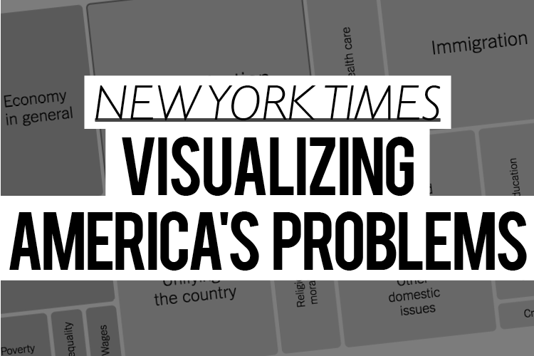
Visualizing America’s problems
Creator: The New York Times
Summary: A visual snapshot of the nation’s problems.
_____________________________________________
The New York Times visualized the main issues on Americans’ minds using an understated, yet highly effective presentation: nested pink, yellow and blue boxes of varying sizes.
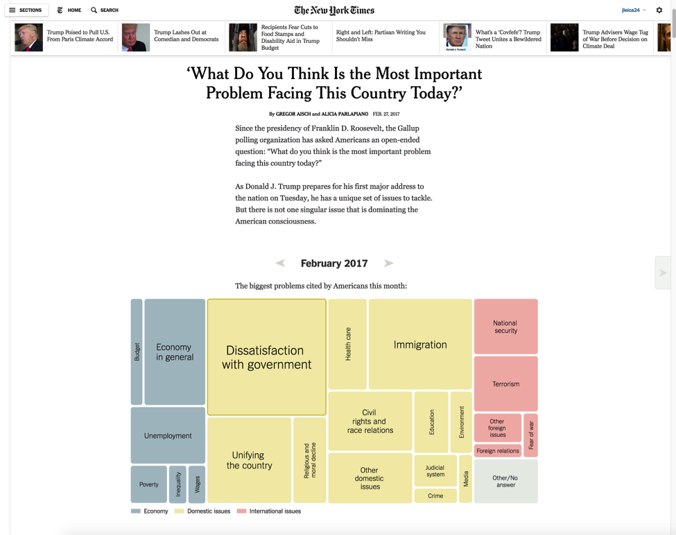
The graphic presentation based on the Gallup poll question, “What do you think is the most important problem facing this country today?” gives readers a hierarchical, at-a-glance view of what presidents faced while in office from 1935 to the present day.
The concept is as simple as it gets — bigger rectangles mean bigger concerns — but the path toward completing this graphic wasn’t as easy as it looks. The final presentation evolved over time.
“We were going to originally run it before the election as a story about what voters care about,” says New York Times Graphics Editor Alicia Parlapiano. “Gregor Aisch, who programmed and designed it, visualized the data as one long streamgraph over time. I collected quotes by presidential candidates that illustrated how they spoke about the biggest issues during their campaigns.
“We kind of ran out of time before the election, so we decided to wait to publish it. Eventually we decided to peg it to Trump’s inauguration and organize it to show what Americans cared about as each new administration came into office. We changed the chart form to treemaps that showed snapshots of the data at certain points in time, which helped solve some of the issues we had with the lack of consistency of categories from poll to poll.”
The story garnered positive feedback in the newsroom and with readers, Parlapiano says. “I think [the visuals] handle well the messiness and variability of the dataset over time, and does a good job of pointing out interesting moments and building a narrative to walk people through it.”
The visual presentation of the Gallup polling roundup consists of:
- a main headline
- short introduction
- 20 panels of varying sizes and colors that indicate the broad categories of “economy” (blue), “domestic issues” (yellow) and “international issues” (pink)
- brief descriptions under each panel, adding context about what was happening at that time.
Had The Times approached this story using a more traditional form, Parlapiano acknowledges that numbers — and lots of them — would be needed, which she believes would make it difficult to make comparisons between administrations.
“It would be much harder to understand the trends without seeing the charts,” she says. Comprised of color-coded nested rectangles and short labels, the story provide a wealth of context at a glance.
Within The Times newsroom, the term “alternative story forms” is applied to anything that is not a traditional narrative, including fact checks, live chats, lists, videos and a roundup of visual forms, which are created by the graphics department and other teams in the newsroom.
A more alternative-storytelling route presents a few challenges, Parlapiano says. “The biggest barrier is probably getting reporters to try a new form when they are accustomed to the rhythm of writing a traditional news story,” she says. “While we try to collaborate with reporters and get them to contribute to alternate story forms we are working on, there is also a paper-wide initiative to encourage new forms.”
And sometimes, she says, presentation decisions boil down to the sheer scope of the project and how that plays into time and technology. Working across platforms, for example — and translating the same project for print, desktop, Web and mobile — must be considered.
“People engage with stories in a newspaper much differently than they do on their computers or on their phones,” Parlapiano says. “Mobile stories tend to do better when they are quickly scannable, while in print we can present stories in a way that requires a little more time for exploration.”
Technical details and modifications: Most of the New York Times’ online graphics are built with HTML and javascript. Parlapiano notes that many staffers use D3, a visualization library. Print graphics are created in Illustrator.
Parlapiano offered a couple of tool recommendations for newspapers with more modest resources than The New York Times: ArchieML, a Google Documents-based markup language developed by Times staffers, used to structure nearly every project; and ai2html, an Adobe Illustrator script created by one of the Times’ editors, which turns illustrator documents into HTML code. “They both allow people without advanced coding skills, like me, to publish well-designed pieces in a short amount of time,” she says.
Share with your network
- Recoding journalism: Some ideas to get started
- NPR: The annotated speech
- Purple: The Political Messenger
- Los Angeles Times: Story stacks
- Baltimore Sun: ‘Dismissed’: Focused on solutions
- Washington Post: Tracking Trump
- Asheville Citizen-Times: Explaining redistricting
- ProPublica: A tweetstorm of facts
- New York Times: Visualizing America’s problems
- Axios: ‘Smarter Faster’ videos
- A portfolio of examples
- Tampa Bay Times: The LEGO Project
- Wall Street Journal: Charting stock and tweets
- Improving accountability reporting: How to make the best of journalism better for audiences
- Your turn
You also might be interested in:
Successfully and efficiently marketing your work can be hard, especially for local news teams with limited resources, but marketing yourself to your audience is an essential skill for news organizations to drive revenue and promote sustainability.
As news teams begin thinking about their election coverage plans, it may feel like adding more tasks to an already full plate, with a fraction of the staff and resources they once had. But that doesn’t have to mean figuring out how to do more with less — maybe it’s doing less with less.
We reached out to Danielle Coffey, the CEO of American Press Institute’s parent corporation, the News/Media Alliance, to learn more about the legal fight for news organizations’ rights with AI.

