We’re about to tell you about several multimedia and interactive elements you can weave into your long enterprise piece. For each one, we’ll tell you what their strengths are, how best to use them and give you tips on how to seamlessly integrate them into your stories.
Photos
Photos matter. Stories with photos, on average, received a score of 113 on the Engagement Index in Metrics for News. Stories without photos got a score of 99. Stories that had multiple photos performed even better: they reached 138 on the Engagement Index — a difference of nearly 40 points.
This was sometimes but not always the case with stories categorized “watchdog,” “major enterprise” or “longform.” Stories with photos didn’t always perform better than those without.
| Mean | |
|---|---|
| Without photos | 98.857 |
| With photos | 113.643 |
| With multiple photos | 137.786 |
American Press Institute
| Among watchdog stories | Among enterprise stories | Among longform stories | |
|---|---|---|---|
| Without photos | 103 | 108.583 | 109.929 |
| With photo | 105 | 87.692 | 98.071 |
| With multiple photos | 110.1 | 106.1 | 122.308 |
American Press Institute
Inside longform stories, how the photographs are displayed matters. With many content management systems, it’s easy to add a slideshow of photos at the beginning of the page. But with longform and major enterprise stories, photos should be part of the storytelling process.
“You want to make sure that the reader still has a seamless experience going through the story,” says Greg Borowski, watchdog and projects editor at the Milwaukee Journal-Sentinel.
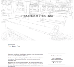
The Milwaukee Journal-Sentinel’s “The Course of Their Lives”
Take the Journal-Sentinel’s special report. The story follows first-year medical students as they learn to dissect a lifeless human body. Photos are strategically placed next to the text. When the narrative describes the life of the woman — once Nana, now a cadaver — readers look to the left and see photos from her life. Headshots of the medical students are also placed to the side — a who’s-who to help the reader picture the students as they read.
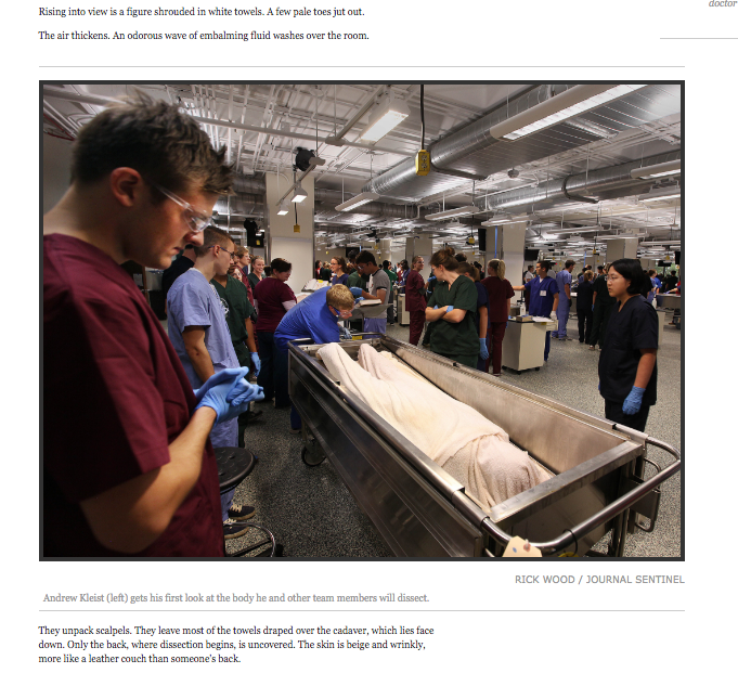
The first photo to spread across the entire page, though, shows the expression of disgust when a student sees the cadaver for the first time. The paragraphs before the photo set the scene:
“Rising into view is a figure shrouded in a white towels. A few pale toes jut out.
The air thickens. An odorous wave of embalming fluid washes over the room.”
The photo that follows flows seamlessly after this description.
Video and audio
Hands down, the multimedia elements that made the largest difference in reader engagement were video and audio.
The Engagement Index for stories jumped by 50 percent when they included video or audio. It’s tempting to assume this is because people tend to spend more time on stories with video and audio simply because it takes longer to watch or listen. But on average, people only spent 7 percent longer on stories with video/audio than without (3:12 minutes and 3:00 minutes, respectively).
The real difference is that more people are viewing stories with video or audio elements, and more people are sharing them. On average, stories with these elements were shared nearly 232 times. Without these elements, that number drops to 136 — a difference of over 70%.
The number of views for a story without video or audio elements was 1,590. With video or audio, that number more than doubled to 3,389 views.
This lift in engagement was true across the board, whether looking at longform, watchdog or major enterprise stories.
| All stories | Watchdog | Enterprise | Longform | |
|---|---|---|---|---|
| With video/audio | 149.929 | 105 | 137.818 | 137.846 |
| Without video/audio | 100.357 | 101.214 | 94.182 | 97.643 |
American Press Institute
Just because these elements increased the number of views and shares on stories, that doesn’t mean readers are watching them fully (again, the time spent on reading the stories was similar for stories with and without audio/video).
I looked at examples and talked to experts about the best ways to incorporate video and audio in these stories.
Video
One way to remedy this? Avoid including video just for the sake of having video in the story.
The key is to make different elements work together as a part of the storytelling process instead of “shoving things into the story for the sake of visuals,” said Rupar of the Washington Post.
“It’s not helpful,” Rupar said. “Readers can tell if you’re not serving them, if you’re serving some kind of internal purpose instead.”
Again, video, like photos, is best used when it serves a specific storytelling purpose.
“A lot of people are putting money into making video; that’s kind of the hot thing right now,” said Michelle Johnson, associate professor in journalism at Boston University… but video is not interactive. You press a play button and then you just sit there and watch it. You’re not really encouraging them to explore.”
Johnson instead suggests that journalists get creative with video, and she encourages journalists to find ways to make video playful.
In one of her classes, Johnson took her students just north of Boston to cover the New Hampshire primaries. She instructed her students to use 360-degree video technology to show the venue to viewers.
“That allows viewers to pan through the venue,” Johnson said. “We put people into that setting. That’s going to keep something engaged longer than just watching a video play.”
Not long ago, the widespread consumption of 360-degree videos might have seemed like a prediction in a sci-fi novel. In fact, they have become increasingly accessible to those with access to the internet — both Facebook and YouTube allow users to upload and view them.
Not only that, but filming 360-degree videos doesn’t demand a huge investment from newsrooms. Reporters can download free applications for their smartphones to record such video. The Google Street View app is rated well and won’t cost your newsroom a dime.
Audio
Many journalists may be familiar with the tool SoundCloud, which can add audio to a story — clips from a press conference or interview, or even natural sound, to augment the story.
But another audio tool journalists can use to seamlessly add music, natural sound or dialogue to a story is called SoundCite, developed by Knight Lab at Northwestern University. Rather than embedding a separate clip that interrupts the flow of the text, SoundCite allows you to embed sound into the text, kind of like this:
Another more ambitious way to add audio to a story is by making it into a podcast.
That’s what Milwaukee Journal Sentinel reporter Gina Barton did with her project Unsolved, an investigation of a boy’s murder from 1976 that remains, well, unsolved to this day.
The podcast allows the story to unfold over seven episodes, which means that the audience could consume the story over an extended period of time. In addition, a podcast is a unique form of media. The reporter literally speaks to the listener, which creates an intimate experience.
Graphics and interactives
If reporters in your newsroom have programming skills, you can create stories that not only have interactive elements, but that are interactive themselves.
Take Failure Factories, the Pulitzer Prize-winning piece from the Tampa Bay Times about failing schools in Pinellas County, Fla. The prologue walks the reader through several types of data visualization illustrating the disparity in schools; all the reader has to do is click.
In another section of the story, the narrative is intertwined with individual stories from kids.
“We build a lot of things from scratch,” said Adam Playford, the director of data and digital enterprise as the Tampa Bay Times. For the most part, the team at the Times uses JavaScript, HTML and CSS — all languages used to design pages and make them interactive.
And that interactive prologue, data visualization and all?
“That was built with JavaScript and D3 (a JavaScript language for interactive data visualizations),” Playford said. “Really, the end result is just 3,000 lines of D3.”
If your newsroom doesn’t have programmers, but you’d like to try your hand at this sort of interactive storytelling, you have a few options. Consider hiring someone with programming skills, or perhaps hiring a freelancer. Alternatively, pay for some of your reporters to take beginning programming classes.
Timelines and maps
Maps and timelines are fantastic tools to contextualize an event and situate the reader within time and space.
Timelines can be relatively simple. Reporters can simply type them out through text, like this one at the end of a story about a wrestling family from Texas. Or, timelines can be used to keep readers informed in real time, like the Charlotte Observer did when a police officer testified after being accused of wrongly killing a citizen.
Static text timelines are fast, easy and convenient. But with the right tools, interactive timelines aren’t difficult to make either. Knight Lab offers a free tool called Timeline JS that allows users to create timelines easily, by putting data into a spreadsheet.
Here’s what a finished one looks like:
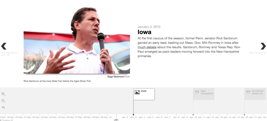
(You can find the full timeline, the Republican Run-Up, here.)
And here’s a timeline I made about my existential career crisis. From start to finish, creating the timeline took about 20 minutes. (My existential crisis took a lot longer than that.)
Maps are also helpful service tools for readers. They situate events around themselves — either events that will happen in the future (say, a route for a parade), or breaking news events that already have happened (to indicate where a fire has burned down buildings, for instance).
But maps can also help visualize certain data, like income per neighborhood, or the number of yearly arrests in each ward of a city. Again, this doesn’t require an expert knowledge of programming languages.
OpenHeatMap is a fairly simple tool. All you need to do is plug your data into a spreadsheet, save it as a CSV file and upload it to the website.
Here’s an example of U.S. unemployment rates from January 2005 to May 2010, broken down by county.
And sometimes, timelines and maps can be used in unison.
After five police officers were killed in Dallas on July 7, the Dallas Morning News published a piece following the shootings moment by moment the very next day. At the top of the page is a map, indicating where the major events of the night went down. The story starts with the protest at 7 p.m.; as readers scroll down, they follow the chronology as the map at the top automatically moves.
It’s an important piece of journalism that clarifies and contextualizes what was a confusing and scary night for many residents. This sort of service journalism holds readers’ attention — according to API’s Engagement Index, the story did 105% better than the Dallas Morning News’ other stories.
Documents
When it comes to document-heavy stories, there tends not to be a lot of visual potential. The specifics of tax returns don’t necessarily lend themselves to action shots.
So how do you get around this? Upload the document itself.
“A lot of people are using documents as a source of transparency, and a lot of that is done out of a sense of due diligence,” said Ted Han, from DocumentCloud. “That allows readers to essentially to assess the credibility, to some extent, of the reporting that’s being done.”
Most commonly, journalists upload an excerpt from a document through a screenshot and add them as a visual element within the text.
But Han says that this strategy tends to take away from the context of the entire document itself.
“One of the downsides of snapshotting is that you lose that sense of connectedness of how that snapshot relates to the rest of the document,” Han said. “So you’re expecting readers to connect the dots, but the readers don’t have reference to the original document.”
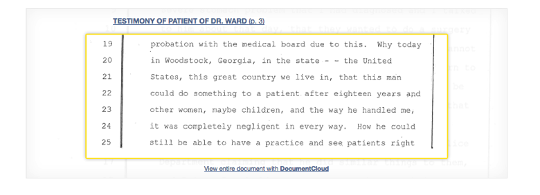
One way to reconcile this dilemma is by adding an excerpt that flows with the story, but also adding a link to the rest of the document so that readers can click through if they wish to read more. The Atlanta-Journal Constitution took this approach in its investigative series on doctors and sexual abuse:
Of course, not every reader has time to read through hundreds of pages of documents and come up with an analysis themselves. Another way you can utilize documents while keeping them accessible to readers is by annotating documents: Highlight the important parts. Add notes for context.
That’s what St. Louis Public Radio has done with all of the documents surrounding the police shooting of Michael Brown in Ferguson, Mo. They’ve compiled all of the documents relating to the case — including papers from the grand jury trial and the Department of Justice reports — but they’ve highlighted and annotated significant sections of the document. That way, readers don’t have to take a month off work to make their way through all of those pages themselves.
How should these tools be implemented?
Several journalists interviewed for this report agreed that the different elements of the story should complement each other rather than offer redundant information.
“I don’t tend to like it if you are reading an interview and you see a video with the exact same interview to the side,” Playford said. “What am I telling you as a reader? What are you supposed to do here?”
In other words, don’t give the reader so many options of how to consume the same pieces of information. If too much information overwhelms the reader, he or she will likely give up on it.
But that doesn’t mean the different elements of the story should be assembled willy-nilly: “You want every piece of that to be well thought-out and well-planned. And I think part of that was having a cohesive style and strategy,” Playford added.
In addition, placement is key — if a photo is integral to the story, place it in the middle of text. If it’s more complementary, to the side. The same is true with all digital tools, including everything from video, maps and embedded tweets.
This Star-Tribune piece on disappearing honeybees follows this strategy well. Some photos extend across the entire page, and they flow along with the storytelling. Other photos, graphics, maps, pull-out quotes and video are on the right sidebar. If readers want to learn more about the anatomy of a bee and the “pollen delivery system,” they can click on an illustration of a bee which expands into a larger graphic, a diagram of the bee.
This is also one of the reasons why communication and teamwork is so important. A reporter may get frustrated if a designer places a photo in the middle of an anecdote, but a designer may get frustrated if a reporter throws 2,000 words into the CMS a few hours before publication.
Finally, too much is … well, too much. Simple is best.
“Don’t get lost in the cool factor,” warns Lily Mihalik, a senior designer at the L.A. Times.
Mihalik referenced the L.A. Times’ investigation on Oxycontin, when she and her colleagues had designed an intricate data visualization.
“We had a chart that, as you scrolled, lines filled up your screen and then collapsed into smaller squares,” Mihalik said. “It was a great piece of programming. But at some point we said — it’s just a line chart.”
If the graphics or elements are too difficult for your readers to understand, scrap them.
What if there’s little-to-none multimedia potential?
Sometimes you’ve got a great idea for a narrative piece, but maybe the photographer doesn’t have access to the subject; or perhaps the story comes from pages of documents (not a lot of visual potential there); or your story is about something that happened 100 years ago, and you’re struggling to find archival images.
This is where you get to flex your creative muscles.
We’ve already spoken about how to annotate documents, or make documents more accessible to readers.
But there are other ways to get creative too.
Art
Consider the story Finding Marlowe by Daniel Miller at the Los Angeles Times. The story is about Samuel Marlowe, first black private investigator in L.A., and mysterious letters between him and a couple of writers. In the letters, Marlowe advised the writers how to make their true crime stories more realistic.
The problem was, the letters had disappeared.
The L.A. Times found only a few visual mementos, and had to work around it. So, they hired an illustrator to draw film noir-style images for the story — and even added subtle animation, such as the rising smoke from a cigar.
Art works especially well for stories that involve any sort of recreation, memory or flashback, said Blake Nelson, a graduate student at the University of Missouri who has drawn illustrations for the Columbia Missourian and the Investigative Reporters and Editors Journal.
“Drawing and comics work particularly well with memory, because that subjectivity of memory goes well with the simplification and abstraction of a drawing,” Nelson said.
Granted, few newsrooms have the resources and budget to hire a resident artist, like Alabama Media Group did in 2015. But there are other ways you can incorporate artwork into your story.
For instance, you can hire a freelance artist to work on a single project. Or partner with a school or university and hire art students who don’t charge much for their work but are looking for valuable exposure in publications. Alternatively, you might already have an artist on your staff and might not know it. Ask around, see if anyone in the newsroom has artistic ambition, and invest in a few art classes to hone his or her skills.
Databases and data visualization
For data-heavy stories, you might try a different approach. Alexandra Zayas, enterprise editor at the Tampa Bay Times, created an interactive database for her story about trauma centers in Florida. Readers can find how much their local medical center charges for certain types health services and they can compare those costs to other hospitals around the state.
“After that piece published, to this day — four years after the fact — I still get phone calls from people,” Zayas said. “A user-friendly database, a first-of-its-kind unique database that an organization can build that could help people make decisions in their lives — that is extremely valuable.”
As previously mentioned, the Tampa Bay Times has been successful in creating interactive database because they’ve hired a cohort of data journalists. But again, this could be tough for newsrooms without the resources to assemble a data team.
The good news is, programming skills are not required for some clean data visualization.
Tableau Public is an easy, user-friendly online tool that allows users to input data for some smart data visualization. Upload your data, follow the steps on the website, and you can make anything from charts to timelines, maps to a visual analysis of Twitter hashtags.
Similar services are Google Fusion Tables, Chartbuilder (an in-house tool from Quartz that they’ve decided to share), Silk, and the aptly-named DataHero.
Share with your network
Engaging readers with longform journalism

You also might be interested in:
The study’s findings likely align with news engagement behavior you’re already noticing, but the data across age groups shows these shifts cannot be written off as a passing trend that younger generations will age out of. Here are four key takeaways and what they mean for local news.
This report draws on a nationally representative survey of teens ages 13–17 and adults 18 and older, providing one of the most comprehensive, generationally comparative looks at how Americans navigate an increasingly complex news, information and media ecosystem.
Local News Day highlights five ways these organizations matter within their communities. We’ve rounded up some of our favorite examples of this work in each category.

